First hand experience of SAS Visual analytics: Needless to mention that SAS has wonderful capabilities , a work is done to experience the features of it.
Meta data
Cars produced in the three regions- US, JAPAN and EUROPE
Year of production : 1971- 1982
Objective: Understand the data set - get information about the pattern , likes and dislikes, give statistics about the measures .
1.The above picture gives information about the split of cars in each of the areas.
2. The no.of cylinder and the area scatter plot gives an information that Europe had cars which were popular in the 5 cylinder car segment, While Japan had not any 5 cylinder cars instead had only 3. Both those were not having popular cars which had 8 cylinders. US cars were popular only with even number of cylinders.
3.The below graph depicts that there exists a negative correlation between the weight and the miles per gallon MPG. When segmented between the areas, Japan was focusing only in the lightweight segment and more in MPG. Europe was interested in lower weight cars also interested in MPG, whereas US segment cars were having higher weights and lesser botheration in MPG.
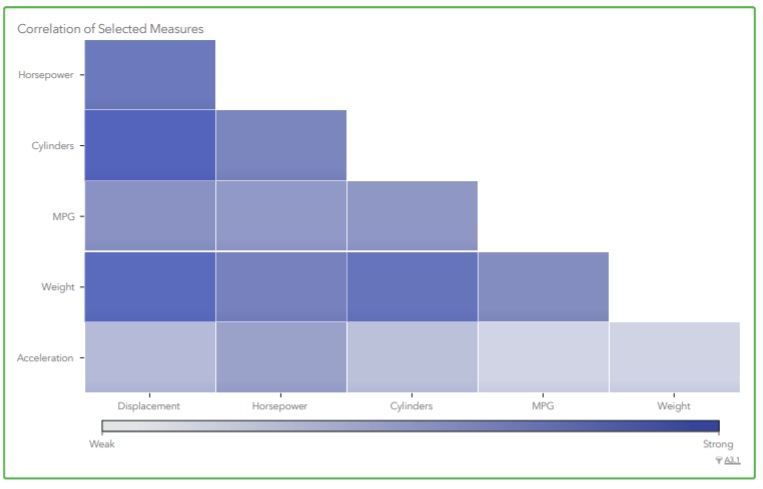
4. SAS also give the correlation matrix- Even if one does not have any knowledge in the particular domain, this coorelation can give lot of insights.
MORE TO COME.......


What an amazing blog this is. There is so much to learn about tableau and there are many people out there who wish to pass the tableau certification exam but don't know where to start from. So such people should start from best tableau certification dumps
ReplyDelete